
This is the first in a series of 3 posts that I have put together on color theory. These posts will be coming out on Fridays. I am calling the series School of Color.
The best way to look at colors in relation to each other is with a color wheel. Sir Isaac Newton was the first to arrange the colors in this manner in 1666.
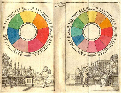
There are 12 basic colors on the RYB (or artists) color wheel. These can be broken down into 3 groups.
There are 3 Primary colors, red, yellow, & blue. In art, these pigment colors can not be mixed or formed by any combination of other colors. They are the building blocks that create all other colors.
There are also 3 Secondary colors. These are orange, green, & violet. The secondary colors are created when two of the primary colors mixed together.
The Tertiary colors are created when one primary color is mixed with one secondary color. There are 6 tertiary colors. They include red-orange, yellow-orange, yellow-green, blue-green, blue-violet, & red-violet.
The color wheel can be divided into warm & cool colors.
 The warm colors include red, orange, yellow, & brown with all of their various hues included.
These colors seem to envelope you, causing spaces to feel small & cozy. They create an active response in the brain which creates feelings of excitement, & passion. When temperatures begin to drop outdoors, I find myself being drawn to the warm colors of Autumn.

The cool colors include green, blue, & violet with all of their various hues included.
These colors are calming, & soothing. They can make a space feel large, & open. They create a passive response in the brain that causes a person to feel calm & relaxed.
I find myself being drawn to the cool colors when it is hot outside & I want to feel cooler. I think of the greens of summer, when plant life is thriving, & blue in the winter when every thing is calm, quiet, & cold.
Black, white & gray are considered neutral colors.
P.S. don’t forget to click the “follow The Fiber Nest” button on the sidebar for your chance to win a box of valentines truffles!

Very interesting! About the only color theory that I know is the one about complimentary colors (opposites) and it’s come in handy a few times. Now, if I could only get the rest of it memorized, I could come up with some killer fair isle patterns… 🙂
I have heard so many knitters say they have trouble with matching colors.
This is the first in a series of 3 posts on color theory. In the next post I’ll talk about color harmony which includes complimentary colors. You can look for that post next Friday.
Yay! I’m looking forward to it! 🙂
Very interesting! About the only color theory that I know is the one about complimentary colors (opposites) and it’s come in handy a few times. Now, if I could only get the rest of it memorized, I could come up with some killer fair isle patterns… 🙂
I have heard so many knitters say they have trouble with matching colors.This is the first in a series of 3 posts on color theory. In the next post I’ll talk about color harmony which includes complimentary colors. You can look for that post next Friday.
Yay! I’m looking forward to it! 🙂
the old color print is so cool!
the old color print is so cool!
[…] Color Theory 101 (thefibernest.com) […]