I woke up at 1 am on a Thursday morning. I was unable to sleep with this unsilenceable notion that God had something for me. So, I rolled over, turned on the light & picked up my laptop. This is what I found. It is a speech given by Elizabeth Gilbert, author of Eat, Pray, Love. As I laid in bed & watched this video, tears streamed down my face as a resonate “YES!” was heard in my heart. I am not alone in this need to create, & the task of meeting this need is not left to me alone. I often have a difficult time expressing my thoughts with words, (this is why I am a visual artists), but on this night God gave me Liz. She has said in 20 minutes what my heart has been trying to tell me, but has struggled to find the words.
I found freedom in worship
I have always considered myself an artist.
Every child thinks of themself as an artist.
I was 13 when I realized that I really could actually draw when I applied myself.
Then, in high school, drawing became my demise academically.
I have had no other ambition in life other than to create.
Art has been one of my greatest joys. Images move me deep down inside & my expressions most often come as colors and lines. Art has also caused me great frustration & longing as my hands long to create, but the inspiration isn’t there.
I have experienced fear that my artwork won’t be enough. That when I am finished, it won’t reveal the message I want it to express. I have feared that others will find my work dumb, and my ability lacking. I have feared imperfection. So, over the years, I have learned to silence my inner cravings to create art.
Recently however, I have been walking through a season of renewal. A fire has been lit inside of me, a passion to explore art as a form of worship. I have given myself permission to create as an outpouring of myself before God, & in doing so, I have experienced freedom. In this place of worship, I am safe to just be me. There is room for imperfection, because I am not perfect. I am no longer searching for others to approve of my artwork because my art is not meant for them. It is meant for Abba, & I have faith, like a child that He will find my artwork to be perfect just the way it is.
Colors
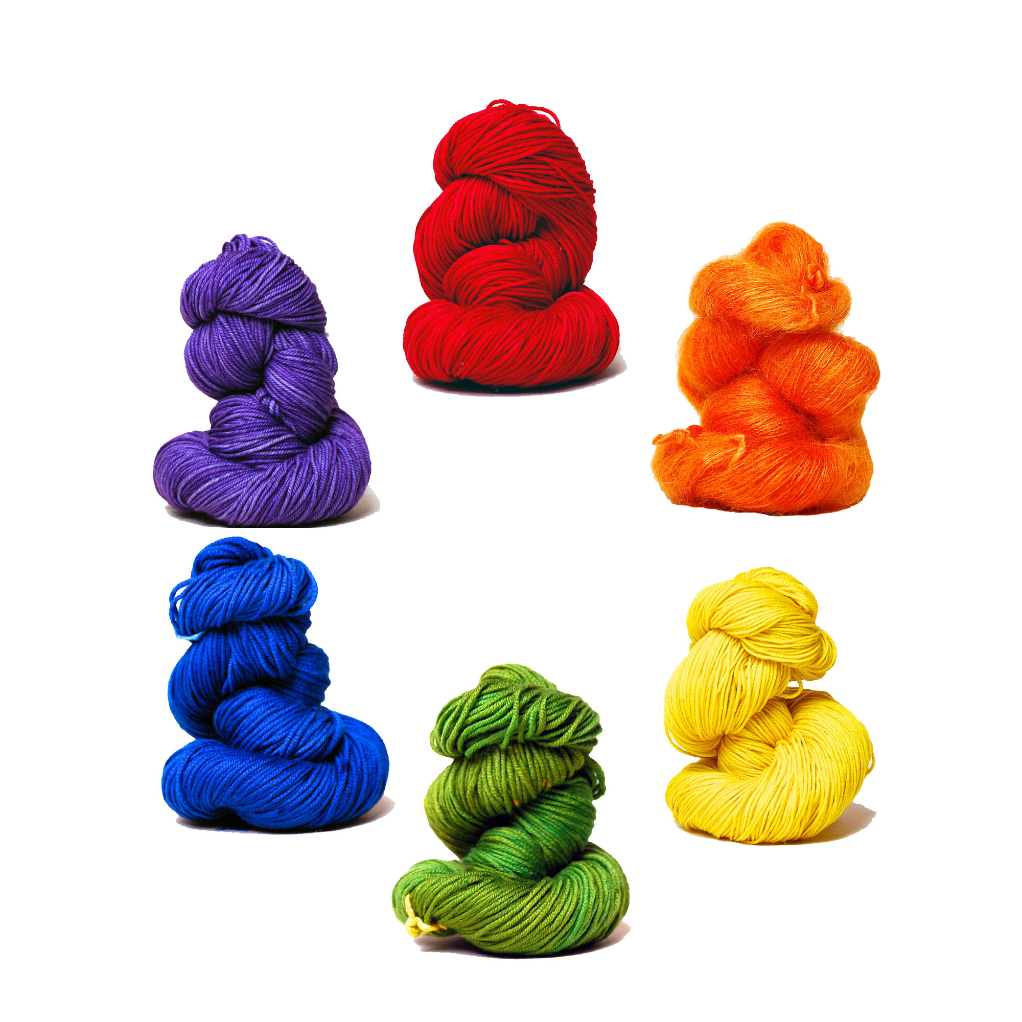
 Red is a very intense color with high viability. It is a warm, energetic color that reflects strength, health, & energy. Red represents joy, passion, sexuality, willpower, courage, & anger.
People who prefer red are often outgoing, & energetic individuals who embrace life with passion. They have a positive outlook on life, & do not like to be bored. Quiet people with a preference for red, may feel the need for the warmth, strength & life-giving qualities of the color. Red is a color chosen by men, women, & children alike.
What colors go with red?
Red is a bold color that makes a nice splash to a neutral pallet.
Red is the opposite of green on the color wheel.
A light tint of blue creates a nice contrast.
. . . . . . . . . . . . . .
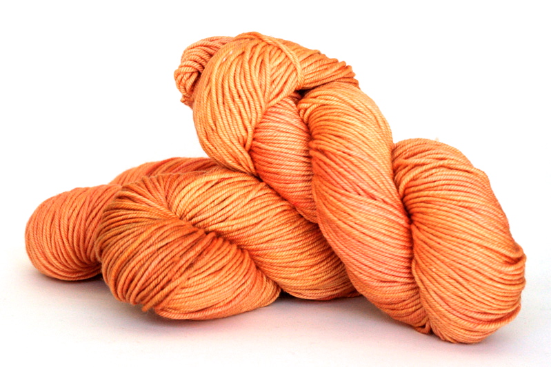 Orange is a warm color that combines the energy of red with the happiness of yellow. It is associated with joy, sunshine, happiness, & creativity. It has an invigorating effect that stimulates mental activity.
Orange is preferred by flamboyant, fun-loving people, & is highly accepted by youth.
What colors go with orange?
Red & yellow can be paired well with orange.
Blue is the opposite color of orange on the color wheel.
. . . . . . . . . . . . . .
 Yellow, the warm color of sunshine, inspires joy & happiness. It arouses cheerfulness & stimulates mental activity. Men often perceive yellow as a color for lighthearted children.
People who prefer yellow are those who are mentally adventurous. They are clear precise thinkers who have lofty ideas & may at times shun responsibility preferring freedom of thought & action.
What colors go with yellow?
Yellow tends to disappear into white, so it usually needs a dark color to highlight it such as brown.
It pairs well with orange or green.
It is opposite of violet on the color wheel.
. . . . . . . . . . . . . .
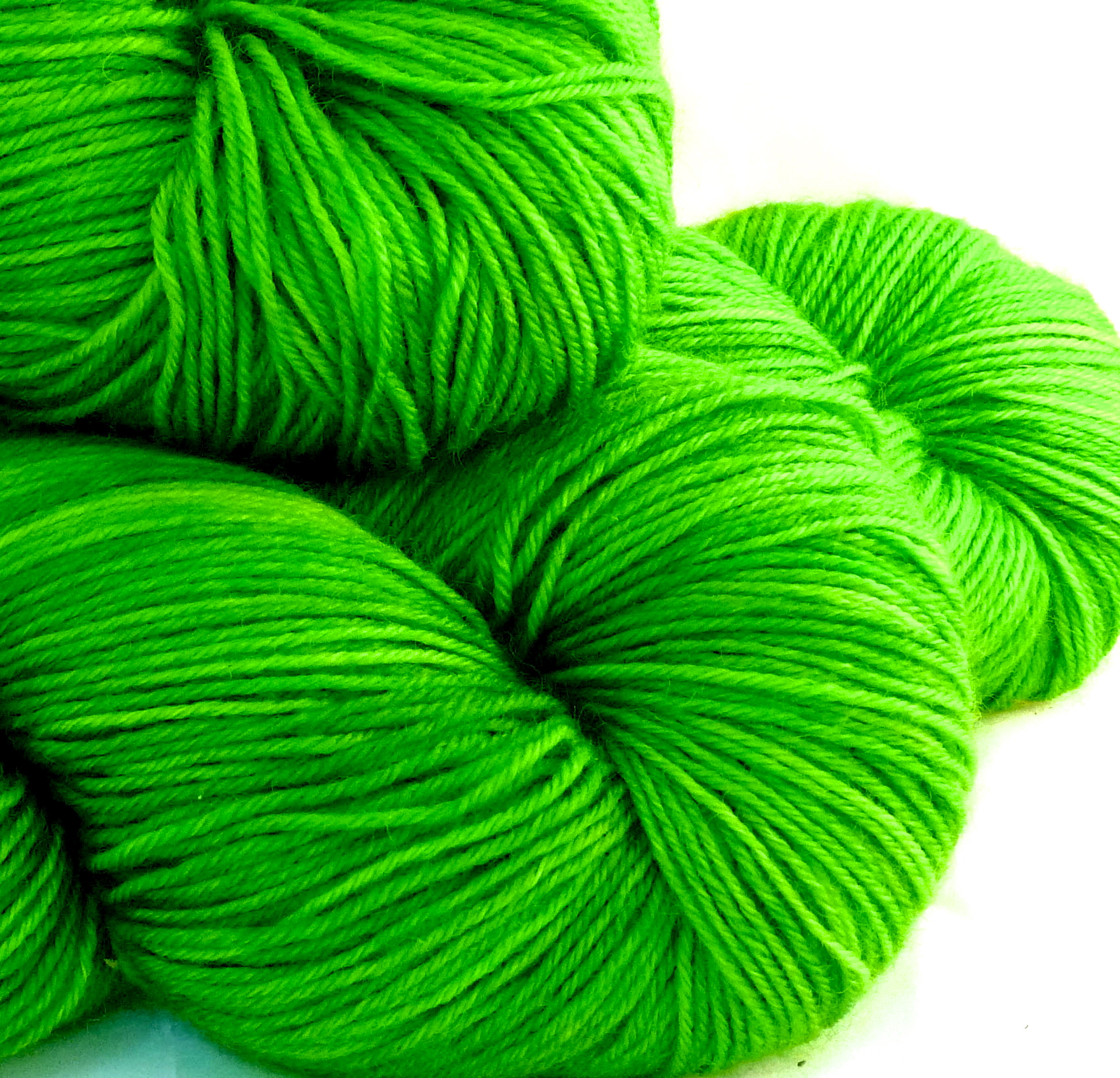 Green is the color of nature. It symbolizes growth, harmony, & freshness. Green is the most restful color to the human eye.
Green is the choice of gentle sincere people who are often frank. They are community-minded people who can be fairly sociable, but prefer peace at any price.
What colors go with green?
Green is a cool color that goes will with yellow or blue.
Red is the opposite color of green on the color wheel.
. . . . . . . . . . . . . .
 Blue is the color of sky & sea. It is often associated with depth, stability & tranquility. It symbolizes trust, loyalty, wisdom, confidence, faith, & trust. Blue is considered beneficial to body & mind by producing a calming effect.
Blue is most preferred most by males.
What colors go with blue?
Blue is a cool color that sets opposite of orange on the color wheel.
It goes well with green or violet.
When blue is used with warm colors like yellow, & red, it can have a strong visual impact.
. . . . . . . . . . . . . .

Violet is a cool color that combines the stability of blue with the energy of red. It is associated with royalty, wisdom, dignity, creativity, mystery, & magic. It symbolizes power, luxury, & ambition.
Violet is often preferred by women & children.
Light purple evokes romantic & nostalgic feelings, while dark purple evokes gloom & sadness.
What colors go with violet?
Blue is a great color to combine with purple, or red can be used for a vibrant contrast.
Violet sets opposite of yellow on the color wheel.
Dream Catchers
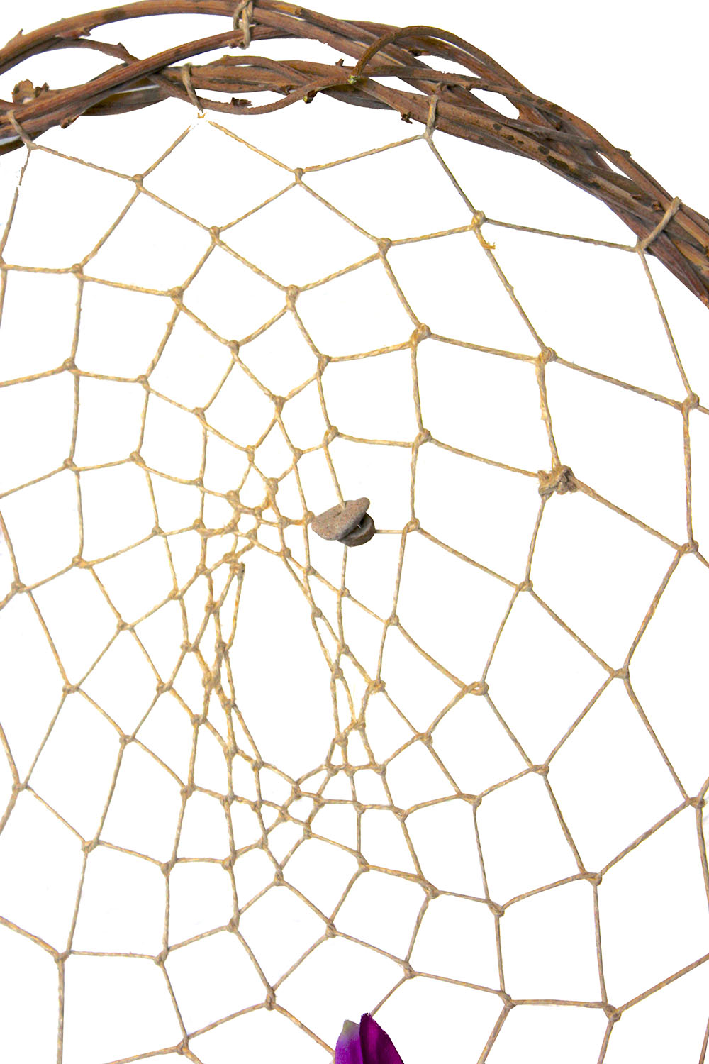
UPDATE 5/4/15: I apologize for the quality of these photos. I am currently working to rewrite this post with clearer images.
Creating a dream catcher is such a fun & meaningful project. They are a lot of fun and simple to make. This tutorial will show you how to do the webbing.
 Materials:
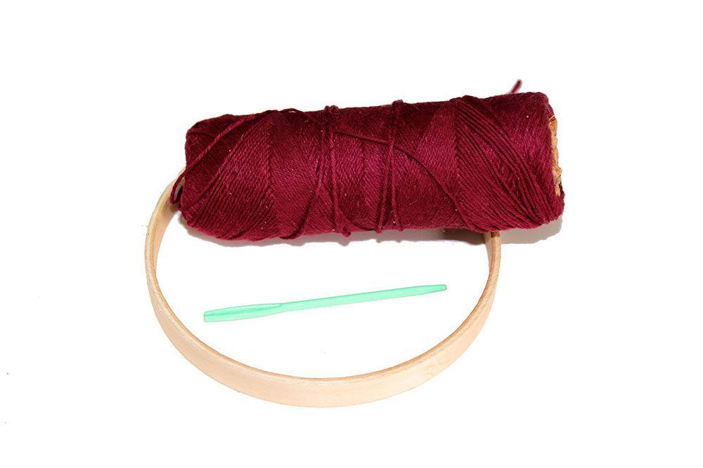
Hoop ~ this can be anything from the inside piece of an embroidery hoop (what I used for this demonstration), a metal ring, or a wreath.
String ~ any type of string can be used, cotton, hemp, yarn, wire . . .
Sewing needle can make the job a little easier, but it isn’t necessary for doing this project.
 1. First, tie the string to the hoop. Then, wrap the string around the hoop as shown. You want the string to wrap around it’s self to help hold it in place. I didn’t do this on my first dream catcher & I found it difficult to maintain the tension that I wanted on each stitch.
2. Work your way around the hoop. Keep in mind the more stitches you have around the loop, the smaller the stitches will be. This is neither good nor bad, but just a different look.
3. Now, you are going to work your way around the hoop a second time. This time, you want to place your stitch on the section of sting between the first stitch and theplace where you tied the string on.
4. Continue working your way around the hoop making stitches between the stitches of the previous round. Look at the arrows on image 3.
5. Keep going around the hoop making stitches between the two stitches above it until you can’t go any further or you decide you are done. Tie the string in place. You may want to use a tiny dab of glue or clear fingernail polish to help secure the knot.
 There are several ways to get creative with the webbing. Here you can see the difference having more or less stitches around the hoop. You can also add tiny beads anywhere you like by threading it onto the string & holding it in place as you work the next stitch. Another idea is to switch colors as you go.
From here the possibilities are endless. Try wrapping strips of leather, or fabric around the hoop, or painting the hoop. Tie different ribbons, & yarns onto the bottom & sides. Tie feathers, stones, sticks, dried flowers, charms, anything to the ribbons.
[] :: [] :: [] :: [] :: [] :: [] :: [] :: [] :: [] :: []
Dream Catcher Kits are now available in my shop!
You are my dream come true . . .
 The past 16 months have been a struggle in our home, & even though our relationships with each other have remained strong, it hasn’t always been easy to appreciate each other. It is hard to express your love to others when you are unhappy & it’s easy to take your family for granted.
As I thought about what I wanted to give to my valentines this year, I thought about how fortunate I am to have a loving, supportive husband. I thought about how lucky we are to have 2 beautiful, healthy children who challenge us & cause us to grow, becoming better people in the end. I thought about when I was younger, how I would dream about my future family & wonder what it would be like to have a husband & children of my own. Now that I am here, I find myself extremely grateful for the ones in my life that I call my family, and even though our life together is by no means perfect, they are my dream come true.
I wanted to find a creative way to express this to my family, so I made each one a dream catcher. This is the one that I made for my husband. It is for both of us really. I made it with our wedding & our life together in mind.
The hoop is made from Wisteria vines. Our Wisteria is one of the first trees we planted in our yard after purchasing our home.
 I tied the webbing with hemp & added some “Indian beads” that I found on the beach of Lake Michigan. I also added a piece of drift wood and some sea gull feathers that I had gathered from up there. The lake has always been a significant place to us. We had some of our first dates up on the lake & we had our wedding ceremony there on the beach as well.
I had a few pieces of broken stalks from the bouquet of orchids that I carried down the isle. Those were tied together & added to the dream catcher.
The strips of fabric are a sheer white fabric that I cut from my wedding dress & a smokey silk from a bridesmaid dress.
The orchids too, were taken off of my wedding dress. These things were just getting dusty hanging in my closet for years. I find this to be a much better way to honor these sacred textiles.
Hawks are one of my husband’s favorite birds. It is symbolic to him. A close friend to him noticed that our family collects feathers, & gave us some hawk feathers that he had found. This was a meaningful gift to my husband so I added one of these feathers to the dream catcher as well.
All said & done, it took me 2 days to create this dream catcher. I loved the hours I spent making it, the quiet time I spent reflecting on our marriage & the memories that came to mind. I love all the symbols with their significance only known by my love & I.
I’m not usually one to get hyped up over Valentine’s Day, but this year it was a meaningful day. I was excited to give everyone their gifts & they all seemed to enjoy the dream catchers.
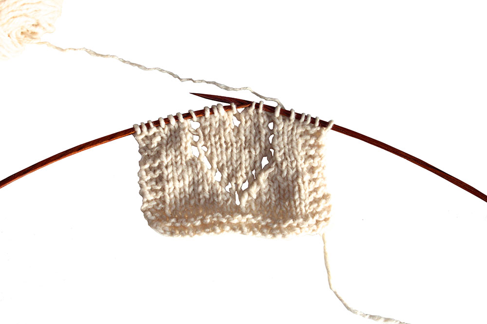
Color Harmony
I have often heard knitters comment that they find it difficult to combine colors for a project. This is one reason why so many knitters choose to strictly follow a pattern’s recommendation for yarn choice. However, selecting colors for a project can be a lot of fun & is an important part of the process in making an item unique. The colors are what give a piece personality & makes an item personal. So let’s talk about color harmony.
Color harmony is a term used to describe color groupings that have a pleasing visual effect. Most knitters have a basic sense of color harmony. We know what we like & what we don’t like. We know what colors & color combinations we find appealing, but for the most part we match colors according to gut instinct. Today, I want to discuss color harmonies a bit more technically.
 Complementary colors are two colors that are opposite each other on the color wheel. There are 3 pairs of complementary colors. They are Red & Green, Orange & Blue, and Yellow & Violet.
 These color combinations have a high contrast with each other, that make them tricky to manage. In knitting, I find it best to avoid these color combinations unless one color is used for a slight embellishment.

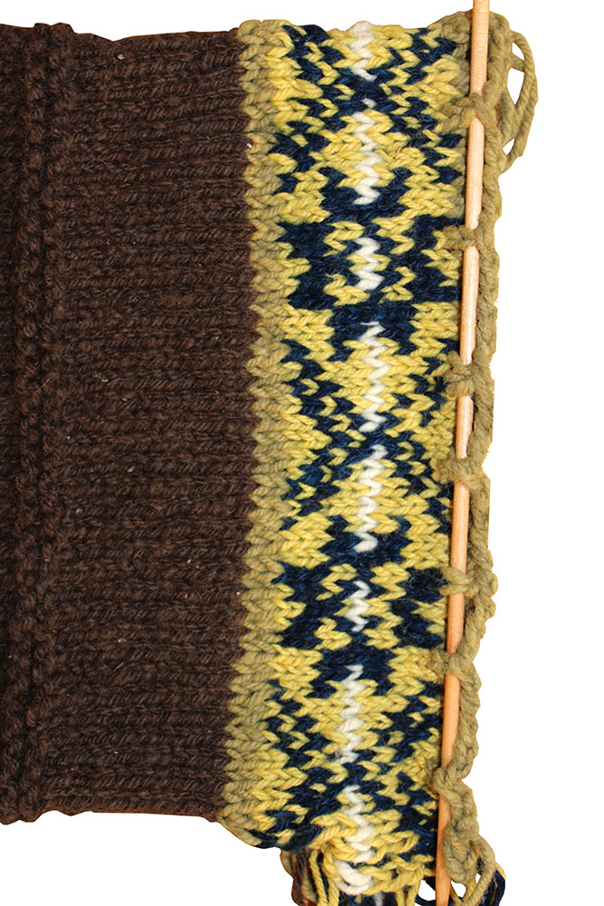
Analogous colors are those that are found next to each other on the color wheel. For example, red, orange & yellow are analogous colors. So are yellow, green & blue. It is best to choose one color to use as a main color, another color as a contrast color, & a third as an accent color.

Triadic colors colors are evenly spaced around the color wheel such as red, yellow, & blue. These color combinations are contrasting & create a vibrant color scheme. To keep this color harmony in balance, choose one color to be the main color, & the other two as accent colors.

There are 4 colors that make up a Tetradic or rectangle color scheme. These four colors are divided into 2 complementary pairs. This color schemes leaves room for a number of possible variation, but the number of warm colors should equal the number of cool colors.
Want more information?
Here are some more examples of the color schemes described above.
Here is a link to even more color theory that I did not go into here.
Did you know that the different colors have different meanings? We’ll talk about these meanings in the final post in the School of Color series. Look for it next week?
Happy Valentine’s Day xoxo

Congratulations to Marcia of Lana Plantea ~ you won a box of 6 Valentine truffles!
Thanks for being a part of my knitting circle!
Knitting is a Love Language
When my husband & I were getting married, we read Gary Chapman’s book The 5 Love Languages. We were young and the wisdom we gained from reading this together was priceless. As the title implies, the book explains that there are 5 love languages. They are words of affirmation, quality time, receiving gifts, acts of service, and physical touch. However, I believe that there is a sixth love language, KNITTING!
 Ask any knitter/crocheter how many items they have created for themselves, and they will most likely give a modest number of items. I have made 4 thing for myself. Now, ask a knitter/crocheter how many items they have made for other people and you likely hear a much larger number. I can’t even tell you how many things I’ve knitted for other people. I stopped counting a long time ago. Why is this? Because, knitting is a love language!
Now, according to Gary Chapman, my love language falls under acts of service & gift giving. So, when I want to express my love and appreciation for someone, my most natural response is to knit something for them. As I spend my time crafting each stitch, my heart & mind are pulled toward that person. I pray for health and I pray for safety. I pray for blessing and joy. The piece I create becomes my prayer and it is my gift to the one I love.
What is your love language?
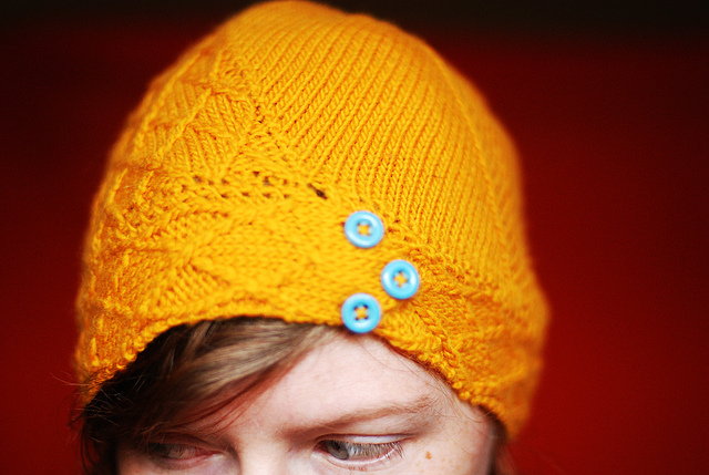
Weekend Knitting
 Kvosin by Stephen West in 100% yak down from The Rocking Yak
Color Theory 101
This is the first in a series of 3 posts that I have put together on color theory. These posts will be coming out on Fridays. I am calling the series School of Color.
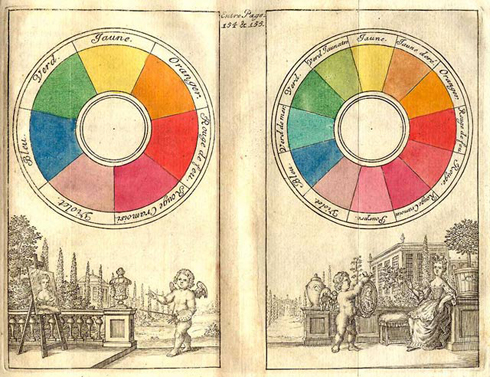
The best way to look at colors in relation to each other is with a color wheel. Sir Isaac Newton was the first to arrange the colors in this manner in 1666.
There are 12 basic colors on the RYB (or artists) color wheel. These can be broken down into 3 groups.
There are 3 Primary colors, red, yellow, & blue. In art, these pigment colors can not be mixed or formed by any combination of other colors. They are the building blocks that create all other colors.
There are also 3 Secondary colors. These are orange, green, & violet. The secondary colors are created when two of the primary colors mixed together.
The Tertiary colors are created when one primary color is mixed with one secondary color. There are 6 tertiary colors. They include red-orange, yellow-orange, yellow-green, blue-green, blue-violet, & red-violet.
The color wheel can be divided into warm & cool colors.
 The warm colors include red, orange, yellow, & brown with all of their various hues included.
These colors seem to envelope you, causing spaces to feel small & cozy. They create an active response in the brain which creates feelings of excitement, & passion. When temperatures begin to drop outdoors, I find myself being drawn to the warm colors of Autumn.

The cool colors include green, blue, & violet with all of their various hues included.
These colors are calming, & soothing. They can make a space feel large, & open. They create a passive response in the brain that causes a person to feel calm & relaxed.
I find myself being drawn to the cool colors when it is hot outside & I want to feel cooler. I think of the greens of summer, when plant life is thriving, & blue in the winter when every thing is calm, quiet, & cold.
Black, white & gray are considered neutral colors.
P.S. don’t forget to click the “follow The Fiber Nest” button on the sidebar for your chance to win a box of valentines truffles!
